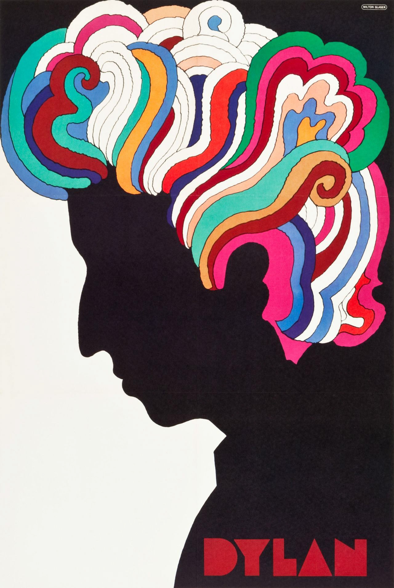
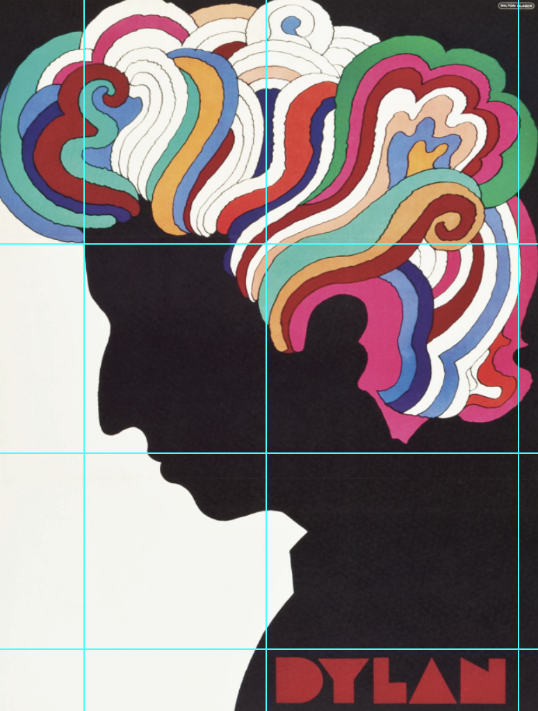
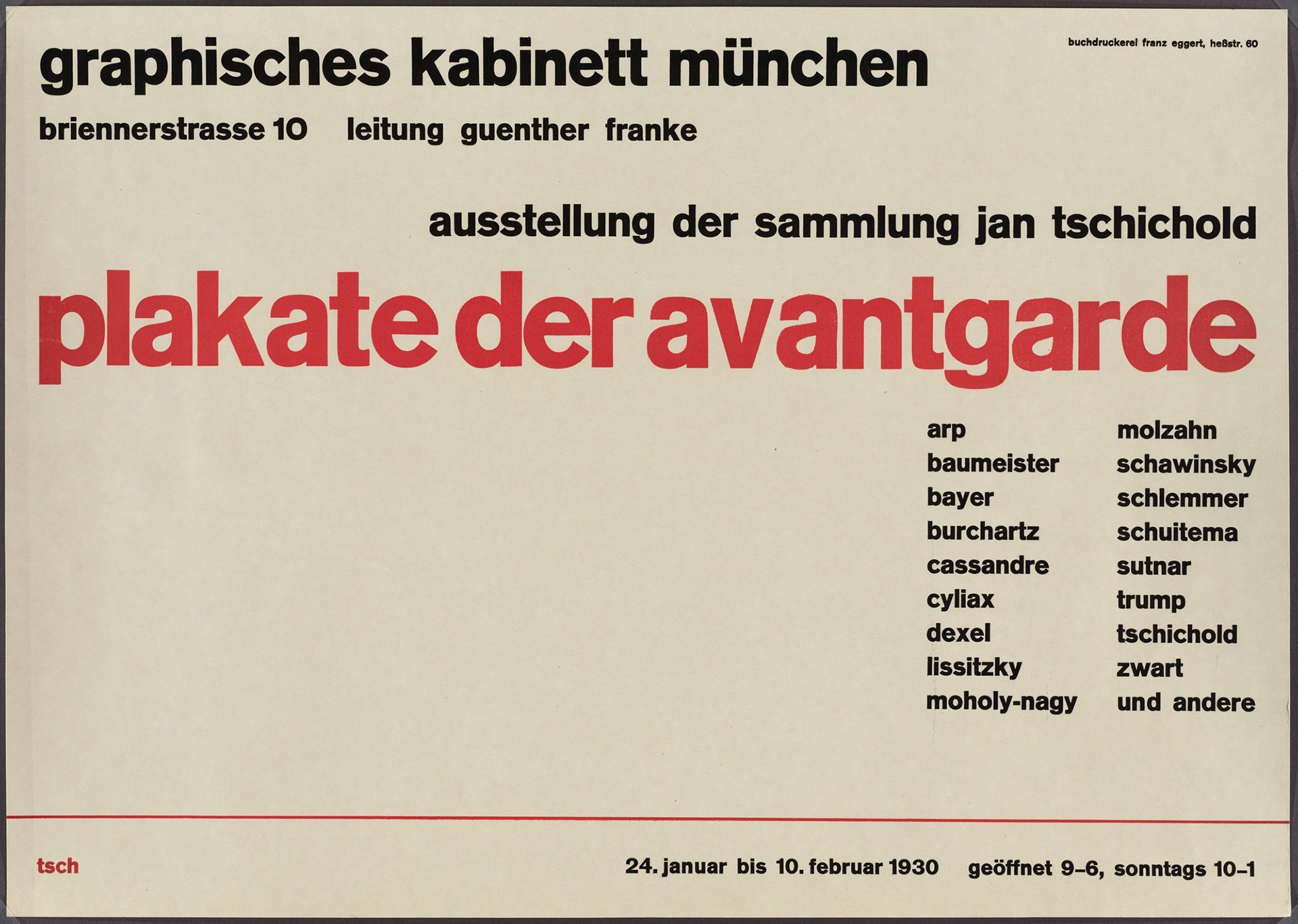
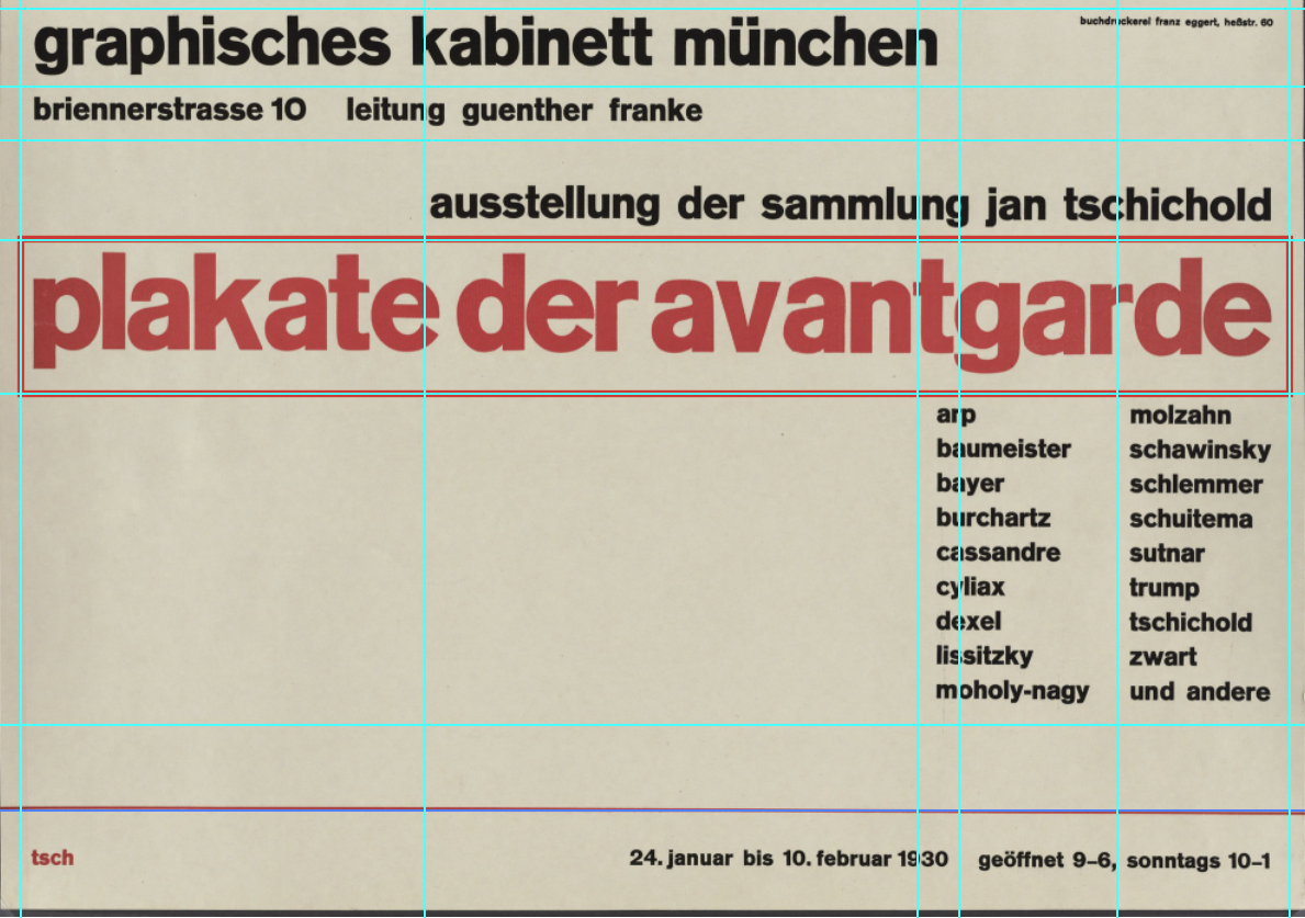
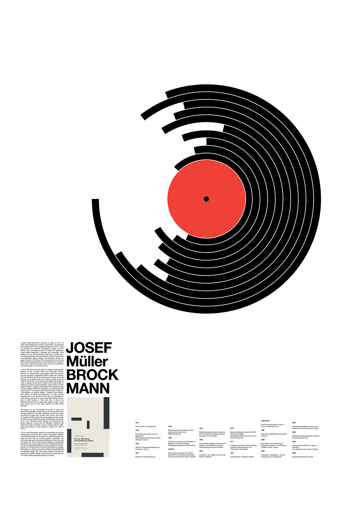
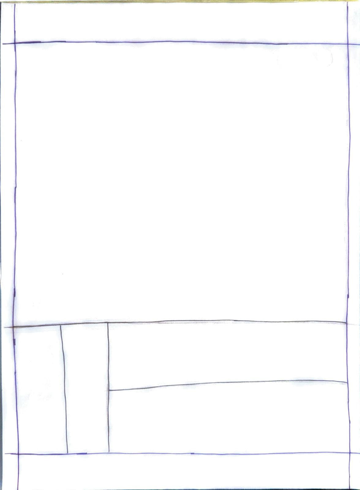
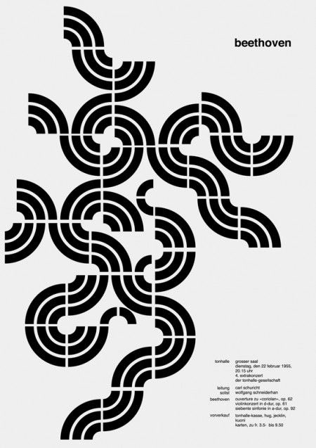
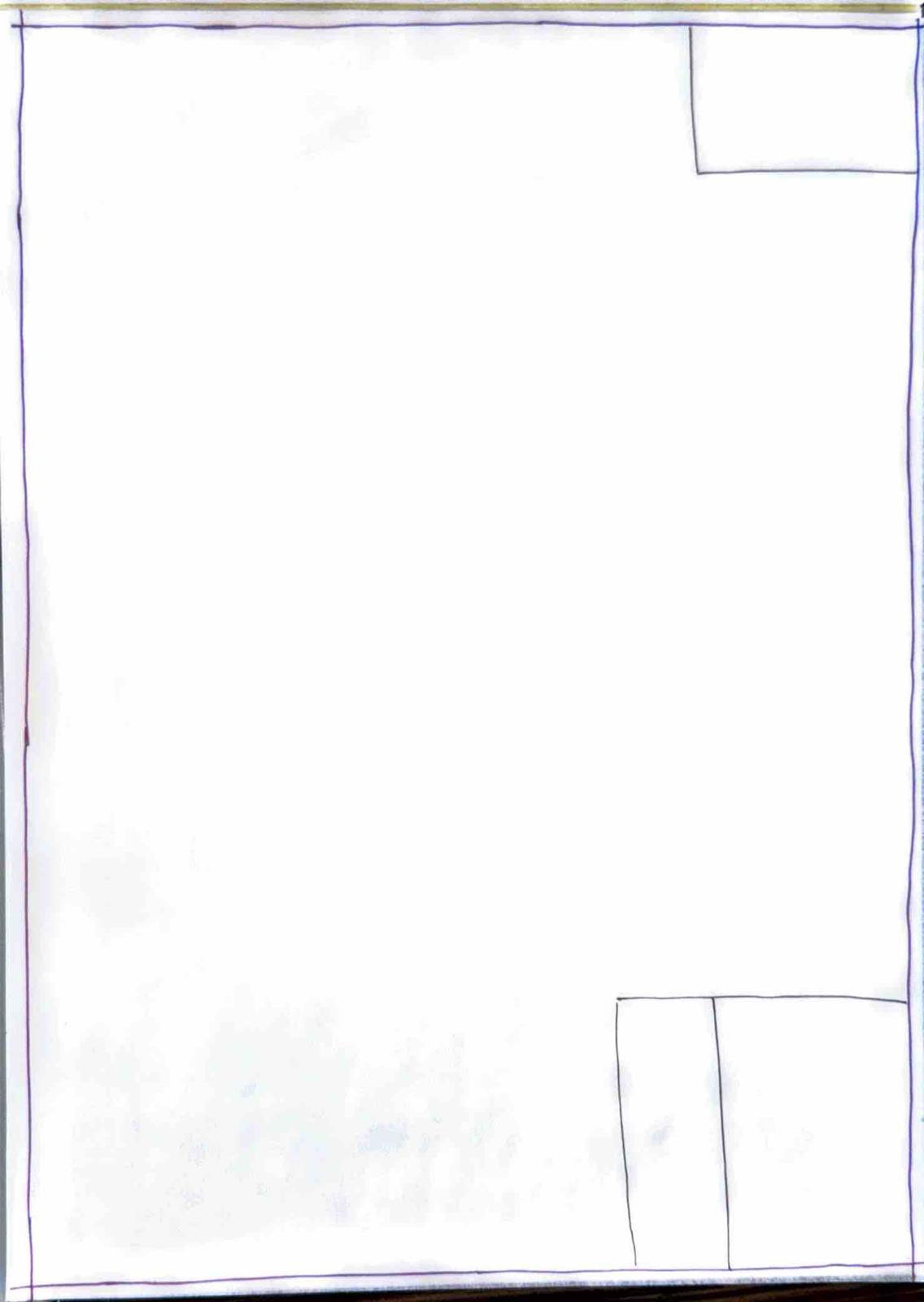
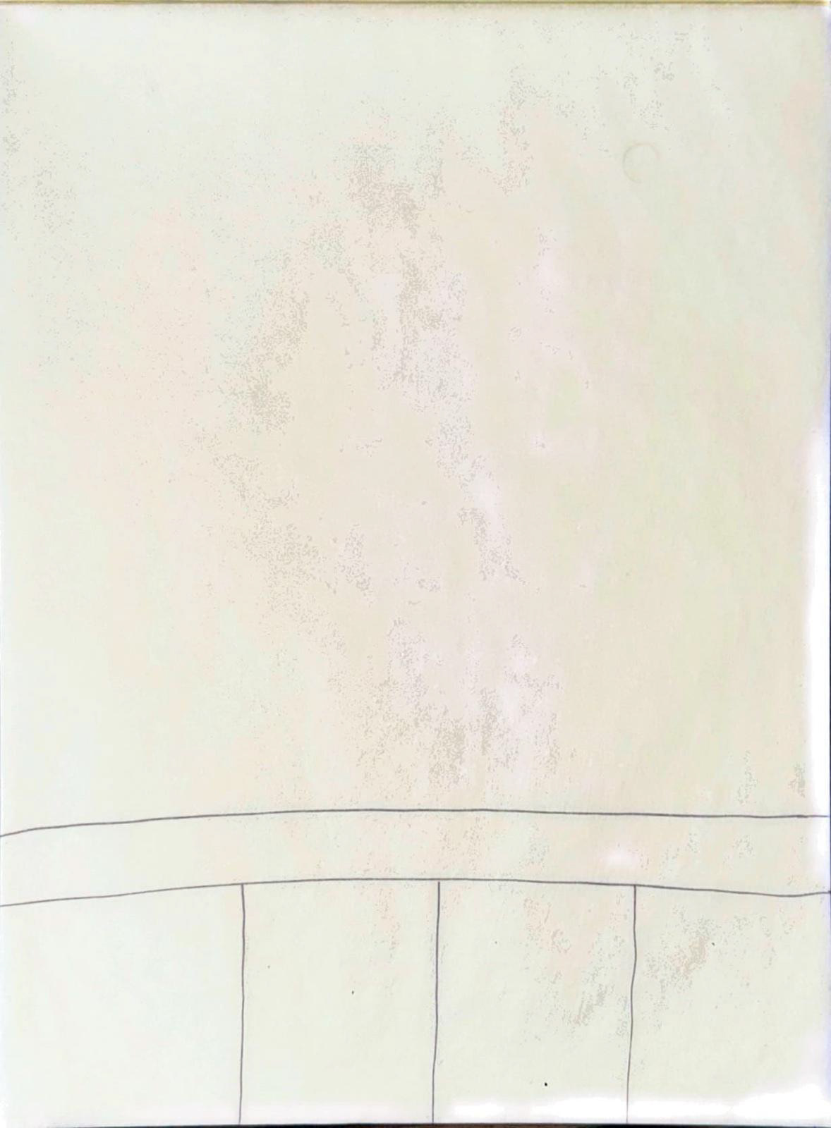
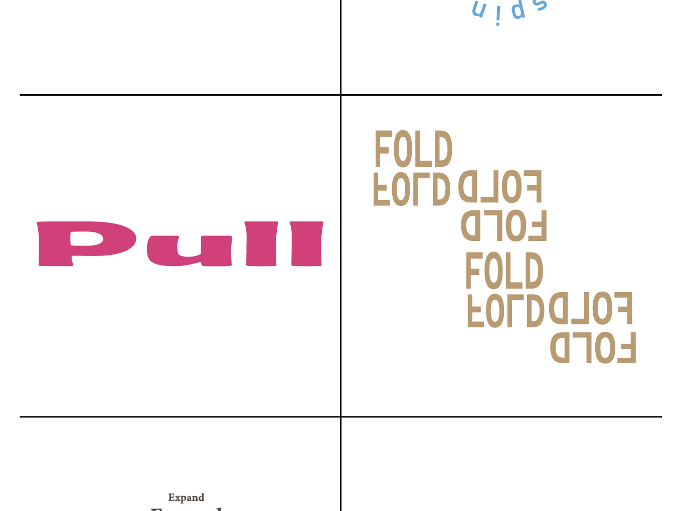
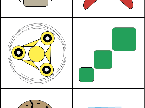
This assignment focused on analyzing poster design through grid systems. Using Illustrator, I traced the underlying structure of three posters to identify rows, columns, margins, flowlines, and spatial zones. The exercise revealed how designers organize content, and sometimes break the grid for emphasis. It helped me understand how structure supports clarity and rhythm in design, and how grids can be adapted to different styles.